EMR Tablet
Redesign
Redesigning the in-VR EMR tablet used in all of Lumeto's healthcare training simulations.
What even is an EMR tablet?
Electronic medical records (EMR) are digital versions of paper patient charts, documenting a patient's medical history, medications, allergies, and vitals. In Lumeto's VR simulations, learners access them through an in-world tablet.
Digital patient chart used in every VR training session
Confusing to use, hard to understand, felt visually out of place
Used in almost all training scenarios. Getting it wrong has real learning impact
I asked more about it and found out: the tablet was created by a dev... Not bashing devs, but I thought this could use some work.
Let's look at what we're working with
Click through the screens below. When I first went through these I was pretty confused — see if you spot the same issues as me.
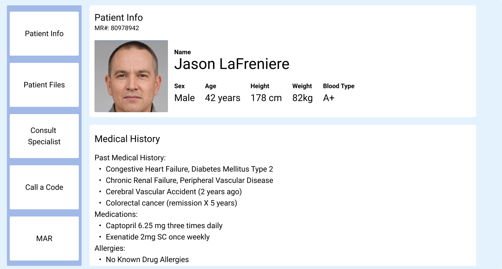
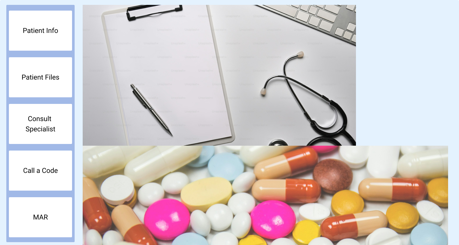
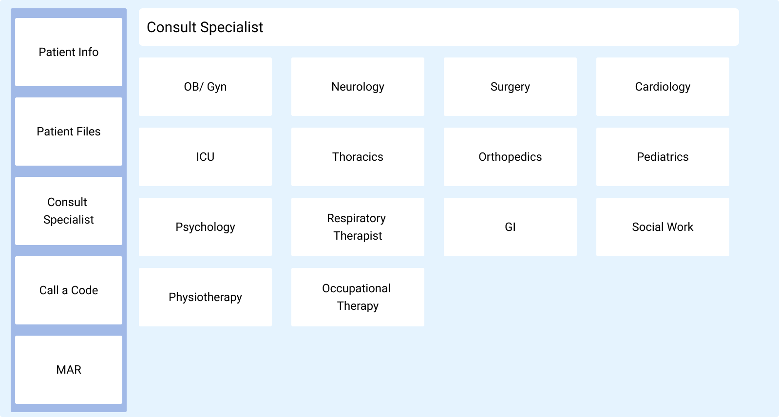
clicking this screen doesn't do anything...
absolutely nothing happened, very confusing interaction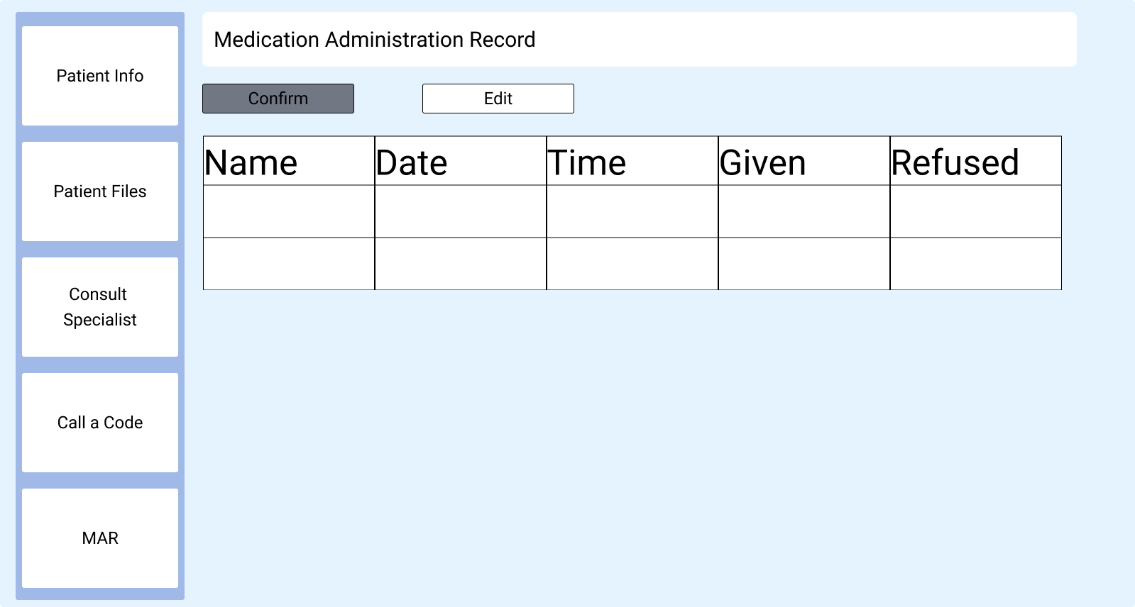
Issue 01
Information overload, horizontal space not used efficiently
Everything is crammed into view with no grouping or visual breathing room.
Issue 02
Inconsistent typography
Too many text sizes and weights with no clear system. Users can't tell what's most important at a glance.
Issue 03
No hover or pressed states
Users don't know what page they're on or whether their input has registered at all.
Designing in VR for the first time
Despite knowing the issues, I faced other challenges while designing in VR for the first time. My biggest hurdle was:
- Unlike 2D, there's no standard button size in VR. The further away a user stands, the smaller everything feels
- The size of the tablet itself in VR space also matters — too small and it's hard to read, too large and it blocks the simulation
- No amount of Figma previewing could replace putting the headset on and testing for real
*recreation of testing I did in Meta Quest 2
Starting with what's on every screen
First I started with the side navigation bar since this would be consistent through every screen.
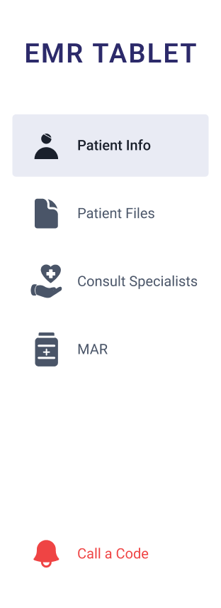
Added the device name
Helps orient learners who are new to Lumeto and this training simulation.
Added hover and pressed states
Users need to know what page they're on and that their input registered, especially in a fast-paced training scenario.
Colours consistent with the web portal design system
The VR tablet now feels like the same product family as the rest of Lumeto's platform.
Icons and labels for each tab
Pairing icons with text labels makes tabs faster to recognise, especially for learners focused on the simulation.
Call a Code moved to the bottom
Separated from the main navigation so it can't be triggered by accident. Emergency actions are styled in red and placed apart so they require deliberate intent.
The redesigned experience
Click each tab to explore the redesigned screens in action
- Introduced a familiar "folder" visual pattern to mirror physical patient charts
- Reduced visual clutter and text overload into multiple clearly defined sections
- Consistent type hierarchy — labels, values, and statuses are visually distinct at a glance
This actually shipped in December 2024
This design got released and you can see it for yourself in VR! If you don't have a headset, don't worry — here's a video of the new tablet in action!
The new tablet live in Meta Quest 2
What I learned
3D design is hard!
Learning a completely new design environment was challenging but really rewarding. VR has its own rules and constraints that you just can't fully grasp until you're in the headset.
2D in Figma doesn't always translate to 3D
What looks great on a flat screen can feel totally different floating in space. Spacing, sizing, and hierarchy all needed rethinking for the medium.