EMR Tablet Redesign
Learners
Teachers
In Short...
Lumeto is a company who creates training in VR for healthcare. I noticed an issue with their EMR tablet and ended up revamping the entire tablet interface in VR, delivering a fresh design that prioritizes user needs while maintaining consistency with the current branding which was released at the end of my coop term.
✎ Tools:
Figma
Meta Quest 2
◴ Timeline:
Two weeks
Feature released Dec. 2024
𐦂𖨆𐀪𖠋 Team:
Just me as the designer
•ᴗ•
Some background + how I got here:
Electronic medical records (EMR) are are digital representations of traditional paper patient charts that document a patient's medical history
In virtual reality (VR), a tablet is available for learners to access these records.
The tablet was confusing to use and understand & felt out of place visually
EMR tablet is used for almost all training sessions so it’s very important asset to be used correctly
I ask more about it and find out: The tablet was created by a dev...
Not bashing devs... but I thought this could use some work, so let’s look at the old EMR tablet and some of its issues.
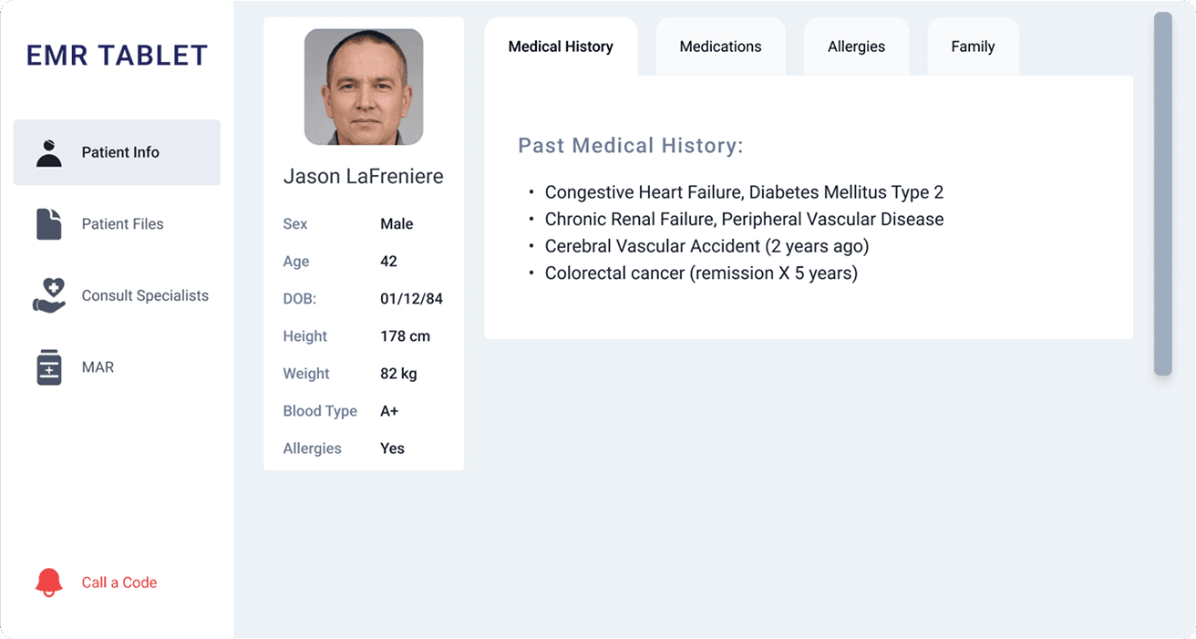
Old EMR Tablet
Info
Files
Consult Specialist
Call a Code
MAR

information overload, horizontal space not used efficiently
Inconsistent typography
no hover/pressed state
Click on the buttons above to see the old screens + hover to see their issues!
VR Challenges
Despite knowing these issues, I faced some other challenges while designing in VR for the first time. My biggest hurdle was:
user friendly button sizes.
3D design is different from 2D, it has it’s own rules
There’s no “standard” button sizes like in 2D, since the size of the button depends on how far the user is from it
I had to wrap my head around this!
Side Nav Bar
First I started with the side navigation bar since this would be consistent through every screen.

Added what this VR device is with the name
Added hover & pressed state for visibility
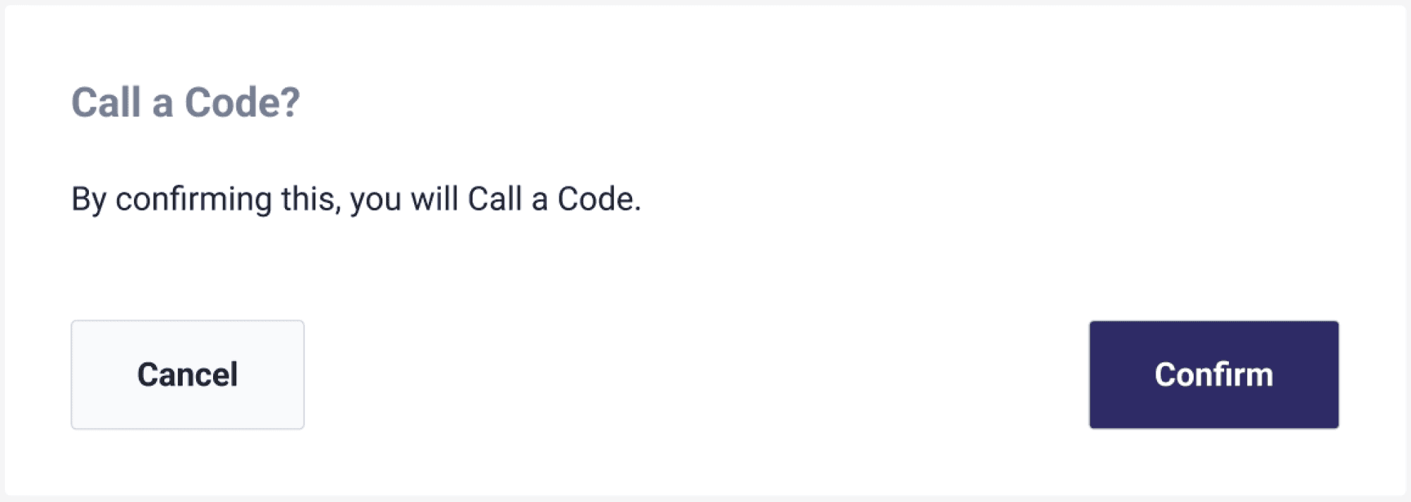
Call a code ended up just being a pop up
Used colours consistent with web portal design system
Included icons to visually show the different tabs
...That looks like this over an existing screen!
NEW (!!) EMR Tablet
Info
Files
Consult Specialist
MAR
Introduced a familiar “folder” visual pattern to mirror physical patient charts
Reduced visual clutter & text overload into multiple sections
In VR!
This design actually got released in December of 2024 and you can see it for yourself in VR! If you don’t have a headset, don’t worry! Here’s a video of the new tablet in action!
Let's Connect
Liked your cafe experience? Let’s chat over some coffee and tea!
(Psst... I’ll pay!)
Sum Liu
Designer & Cafe Enthusiast
© 2025 Made with lots of ☕