Sezzle
In-Store
Virtual Card Map
Building a store locator map and finding ways to reduce confusion around virtual cards.
Sezzle's in-store BNPL feature
Launching in Q1 2026, the virtual card lets users generate a temporary Visa card inside the app and tap to pay at partnered physical locations using Sezzle's buy now, pay later Visa card.
A temporary Visa card generated in the app, tied to a specific merchant, used in-store via tap to pay Sezzle's BNPL credit at a physical register
Only at the merchant you select 500+ in-store locations across Canada
Here's what the original flow looked like:
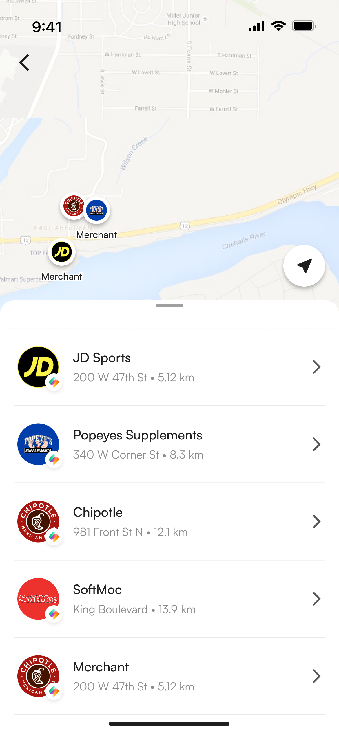
Browsing the store list
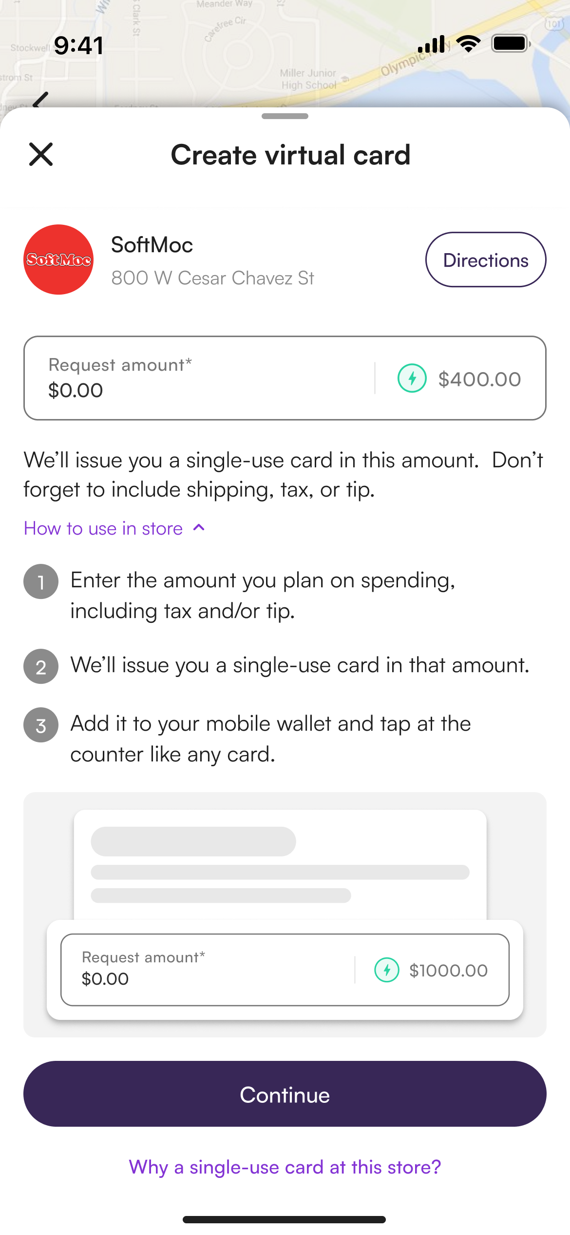
Setting up the card
Activating to pay
I was monitoring this new feature
As this was a brand new feature, I tracked it closely across all support channels to ensure everything was going smoothly. Here are some issues that kept popping up:
~1/day
tickets asking what the virtual card was
Comprehension was our top ticket category consistently. Users especially struggled to understand the difference between the virtual card and gift cards.
Session replay · 2m 14s
VC tab
"In-store"
Users couldn't tell if any store was near them. They scrolled, found no signal, and left.
Sezzle Canada Virtual VISA question
"…are you locked to whatever merchants are on Sezzle? It's not very clear."
Reply
"Seems useless to me too"
Users weren't confused about a detail they didn't understand what the virtual card was supposed to do at all, or how it differed from paying online normally.
We also ran a survey asking users why they weren't using the virtual card.
303 / 500
cited "don't understand how it works" as their #1 barrier nearly 3× the next reason
Grouping up all these insights, there were two clear recurring problems:
"I don't understand what this virtual card even is"
"I can't tell if there's even a store near me"
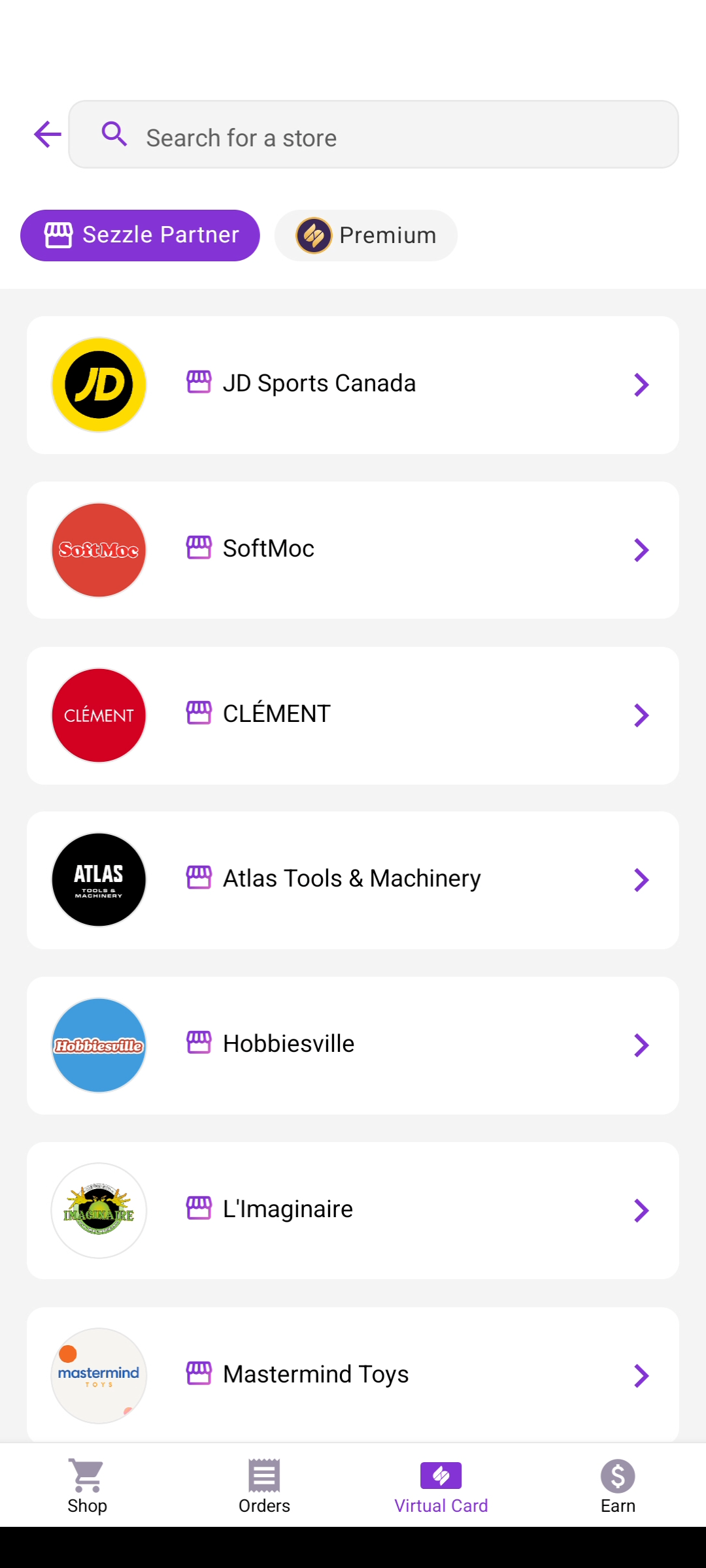
Seeing our current screens, these problems make sense...
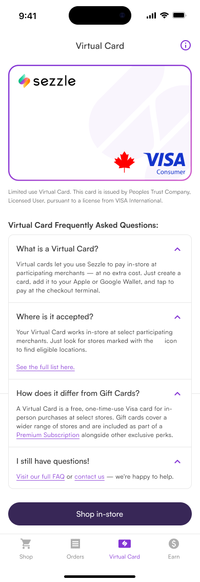
No FAQ or education
No onboarding, no common questions answered users were left to figure it out entirely on their own
No location signal
The list shows merchant names nothing about whether a location is actually near you
No explanation
Nothing in the flow explains what the virtual card is, how it works, or how it differs from paying online
With this in mind, I created a ticket to modify the Virtual Card tab screens improving education and reducing confusion, while also adding a feature to help users figure out where they could actually use their card in store.
Then I started working on the designs for this ticket too!
Map-based store locator + in-app education for Virtual Card
Fix comprehension add education screens into the VC tab and card creation flow
Fix discoverability replace the flat merchant list with a map-based store locator
Answering "wait, what is this?" before they have to ask
Users didn't understand what the virtual card was or how it differed from paying online. The fix wasn't a tooltip or a help article it was building the explanation directly into the flow at the moments they needed it.
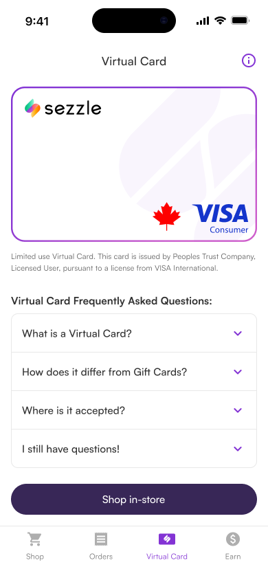
Introducing VC + FAQ
The VC tab now surfaces an explanation screen for first-time users and an FAQ of common questions, so users can get their questions answered immediately without having to go looking.
Why VC vs gift cards?
A lot of the confusion in support tickets was specifically around how gift cards and virtual cards differ and since both can show up in the same VC tab, it wasn't obvious. These screens explain the distinction directly in the flow.
Three iterations to get the map right
Problem 2 was discoverability users couldn't tell if there was a store near them. The solution was adding a map banner/button at the top of the store list where users can view stores by location near them. Getting there took three rounds of iteration.
V1
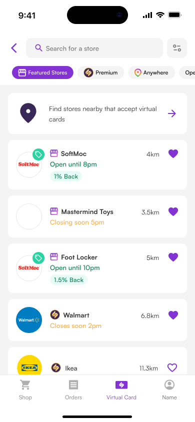
Heavy merchant list deals, hours, distance, and favouriting all crammed in, causing information overload with no easy way to parse what mattered
V2
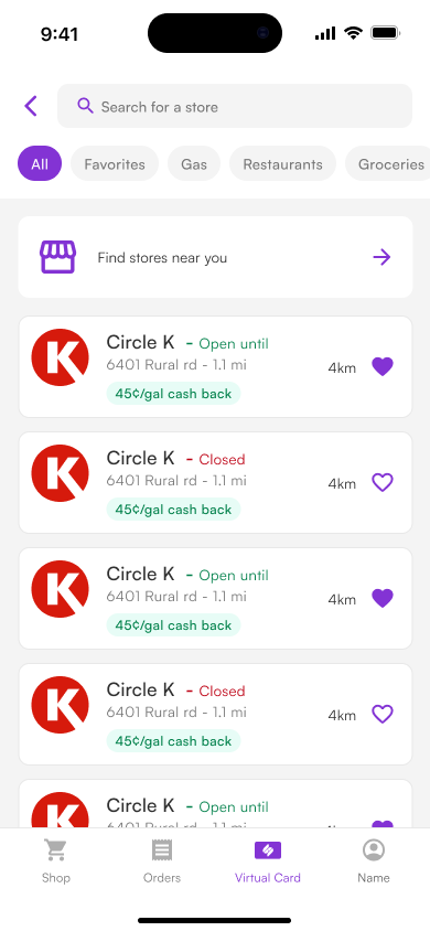
Cleaner display of info but still felt too heavy visually the list alone couldn't communicate proximity
V3
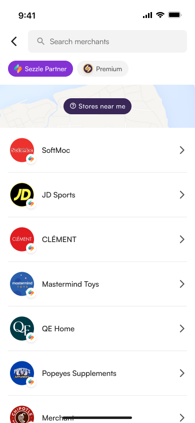
Prominent "View Map" button at the top users get richer distance context by switching to map view
V1
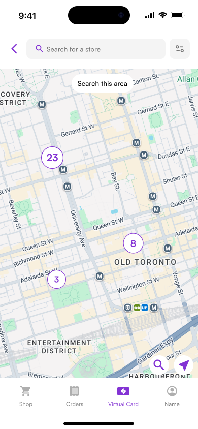
Rough spatial concept pins on a map, zoom levels explored
V2
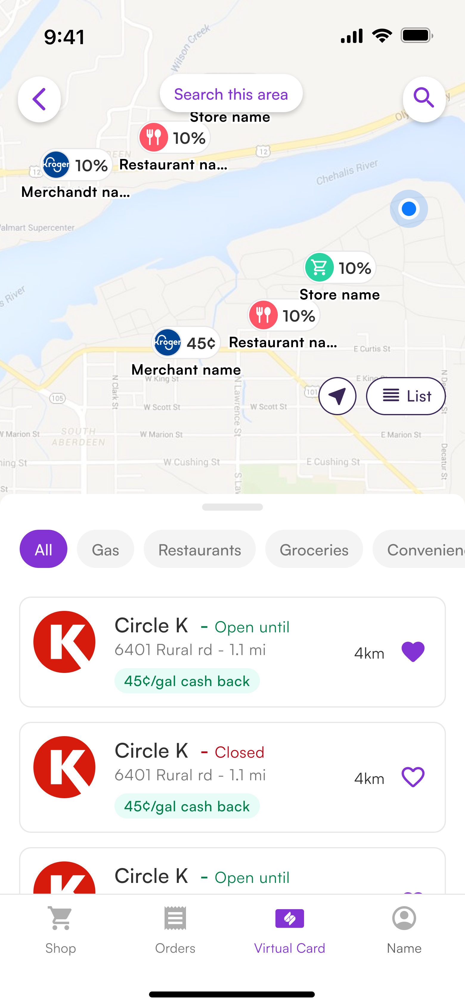
Better map with functions to change from list/search/etc.
V3
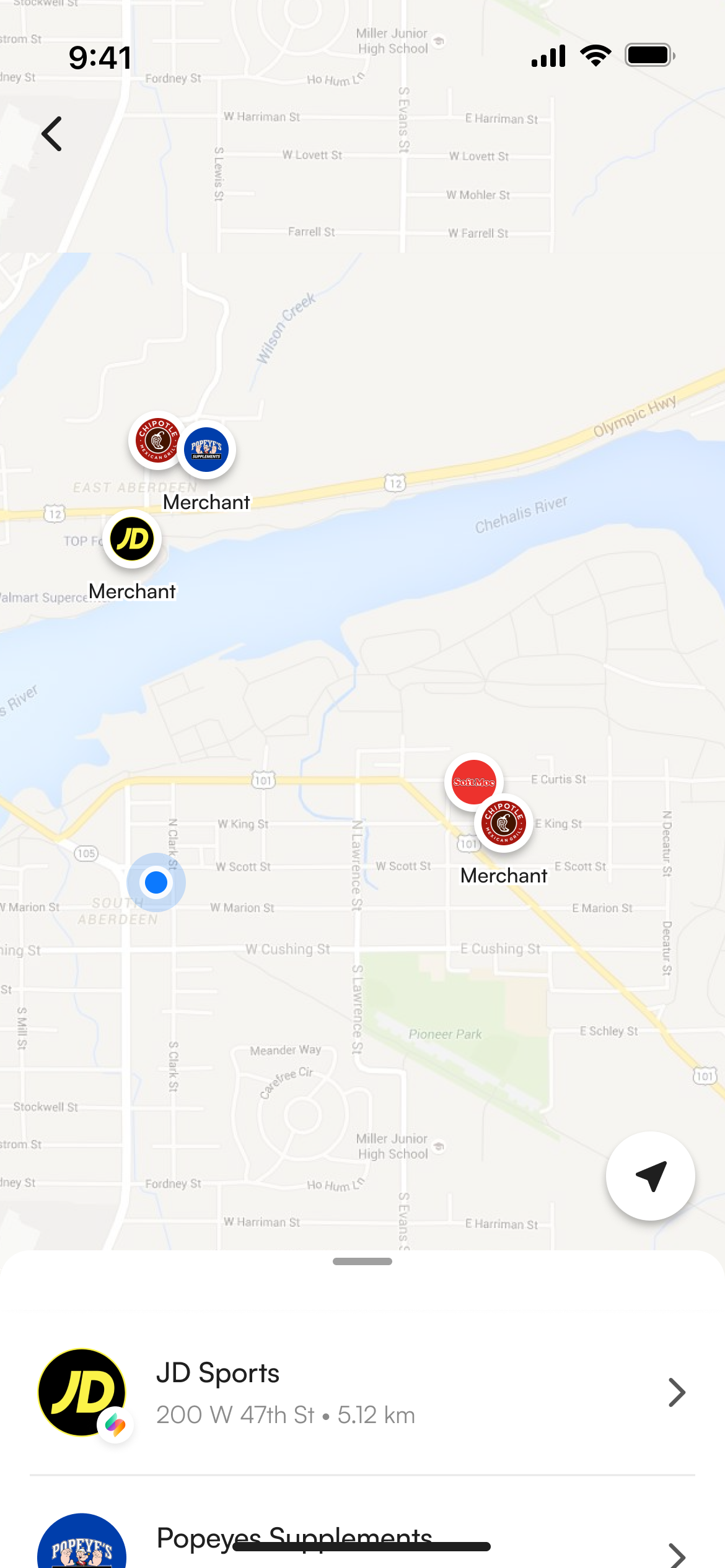
Cleaner UI that only kept the important things
V1
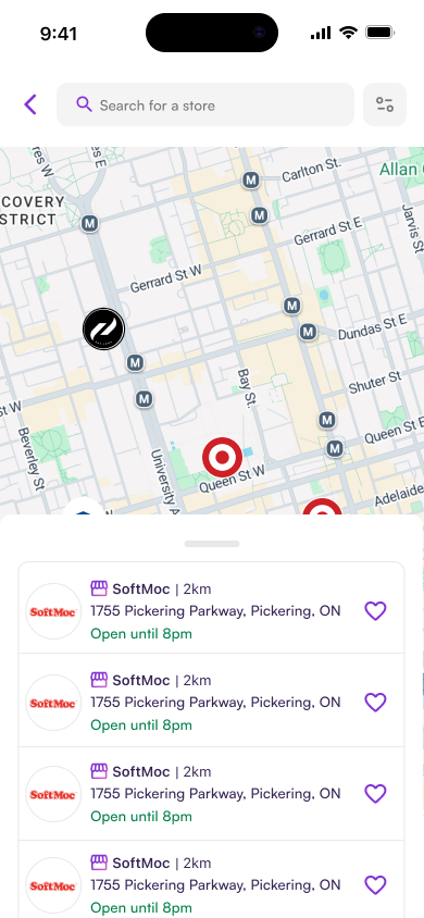
Pin tap shows basic store info early selection state exploration
V2
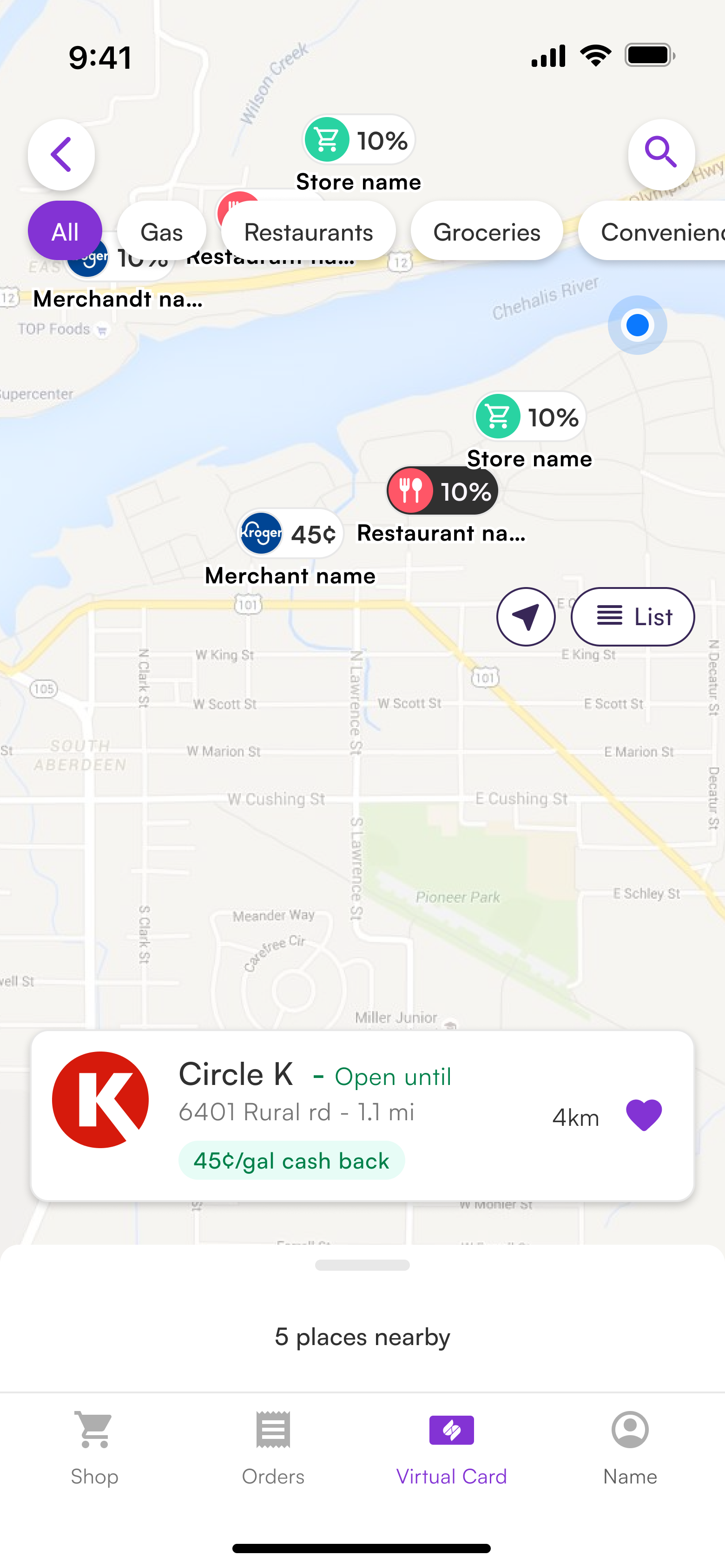
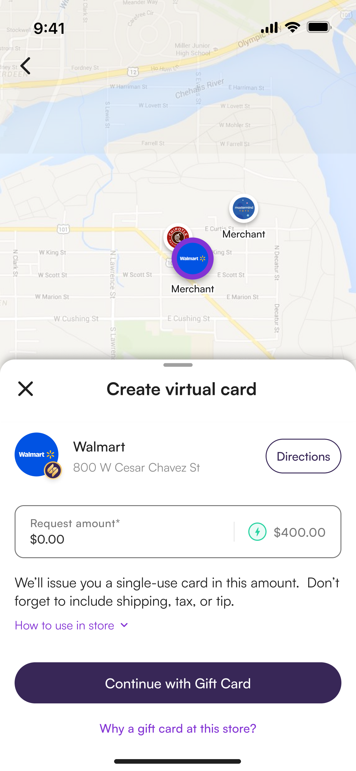
Store card locks in on tap confirms merchant before card creation
V3
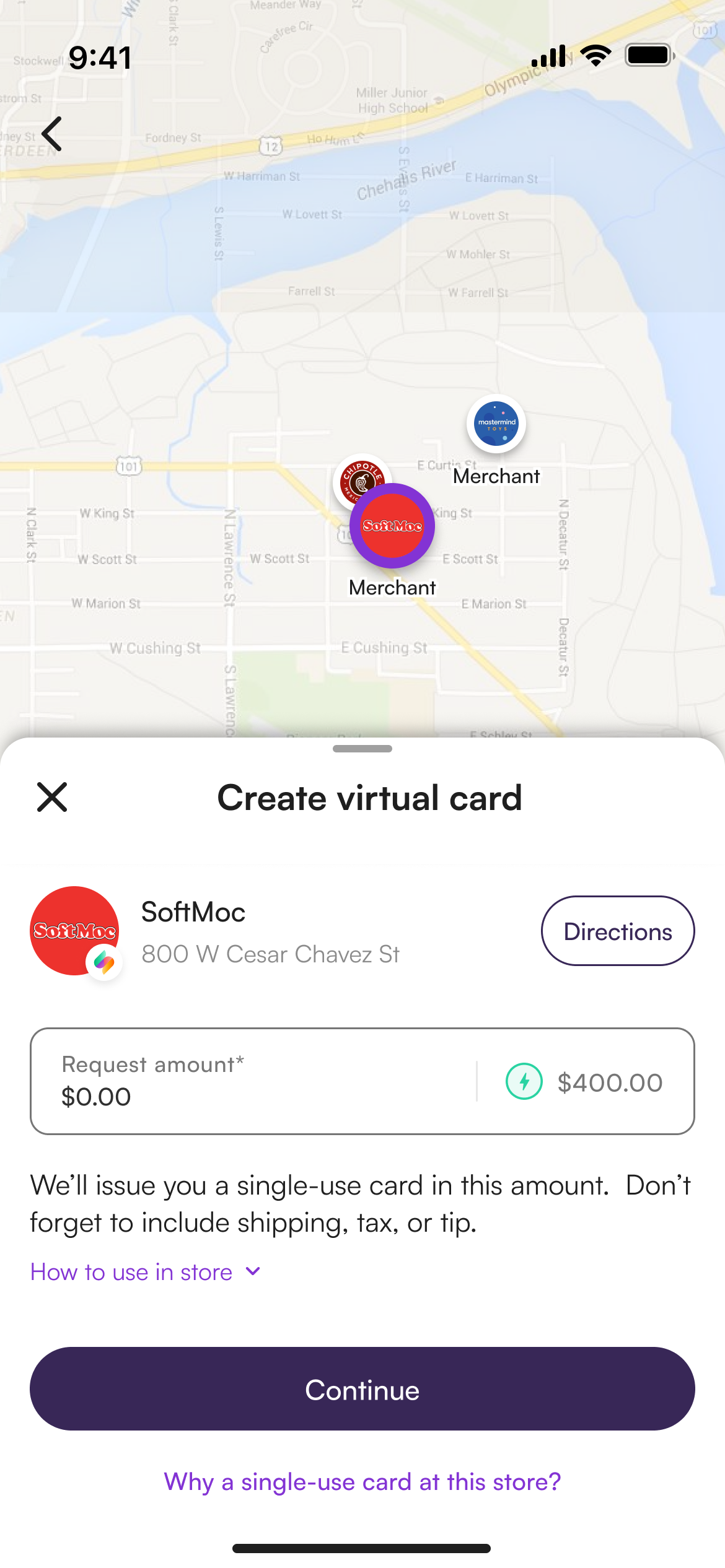
Create the purchase request directly from the store detail no extra screen needed
V3 what shipped
Map-first store finding, a slide-up detail panel, clearer VC tab, and an explicit gift vs. virtual card split at selection.
How we'll know it worked
↓ Tickets
Virtual card confusion volume in Zendesk
↑ Cards
Virtual card creations, tap-to-pay transactions, and in-store purchases
Map use
Are users finding stores through the map vs falling back to the list?
What I took away from this one
Know what to ship now and what to defer
Not every good idea makes the cut right away. Store open/closed hours was something we wanted but without that data available yet, it was a deliberate call to scope it out and revisit it later rather than hold up the release.
Data turns opinion into direction
Having ticket volume, session replays, and survey numbers meant every design decision had something concrete behind it much easier to align on than instinct alone.
OP
"I fail to see why they even implemented this if I could already pay-in-4 at those merchants."